How we built and exited a big data Saas using global remote teams
Sure it's a cheesy metaphor - but it is the actual sunset on my last work day in San Francisco
Leaving a product - especially one you've built from whiteboard to public release is a hard thing to do (and especially one where your desk has the above view). But that's what I'm doing, and as I leave Sonr - as goes the cliche - I've had the chance to reflect on what we've done, what we've shipped and the processes we've developed. This isn't a post about personal failure and / or learnings - I'll be delving into that in a medium post at some point soon (lucky you) - nor is it a commentary on startups or being part of a founding team. It's more an overview of product creation - specifically from my point of view as a Creative Director / builder / shipper / strategist of product (i.e someone with a strong preference relating to pens). Anyway, here's a quick fly-by-night overview of my past two years in Sonr-land.
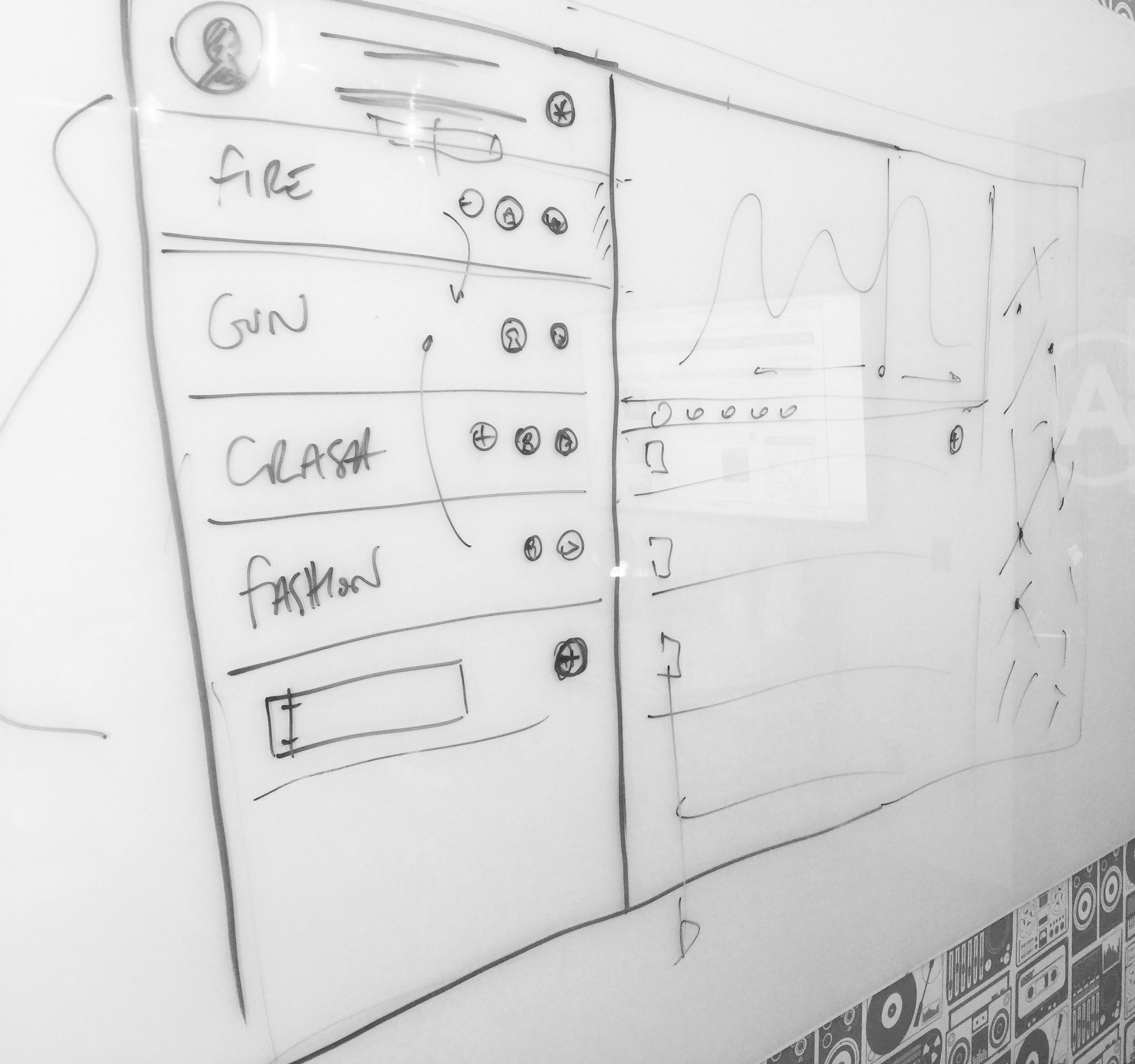
Breaking ground on the product in Potrero Hill with the founding team - the first sketches
We started the product design in San Francisco in 2014 after the initial pre-seed round had closed. We had a whiteboard, a development team and had time-boxed a few days. I'd had a few weeks before my arrival to get some homework done - I'd performed some business canvas workshops, we'd done our requirements gathering from the business and from our potential customer base, we sorted cards, and we'd created our first round of user personas (knowing that we'd end up trashing them within the month). What we came up with in that first office in Potrero Hill was a very basic product specification that focused on business and user verticals - in fact much of the technology at that stage was a relative unknown (such were the joys of social APIs in 2014) but the focus was very much on building a proof of concept. We did this by utilising existing frameworks - specifically Bootstrap - to build the basic front end and get the ball rolling. Using existing frameworks is a great way of bypassing needless development - we were using the framework to test UX hypothesis, but also to give the backend something to output to. That first iteration, those first pre-MVP versions - we excepted their inevitable generic bland ugliness because we knew we'd be throwing them away sometime soon anyway. Using a simple framework can give you an advanced front end in minimal time with minimal spend compared to bespoke front end noodling. It allowed us to take the whiteboard process above to the UI below in weeks rather than months, while giving us the opportunity to quickly iterate front end elements around without slowing down backend development schedules.
The initial Bootstrap mockup which raised Seed
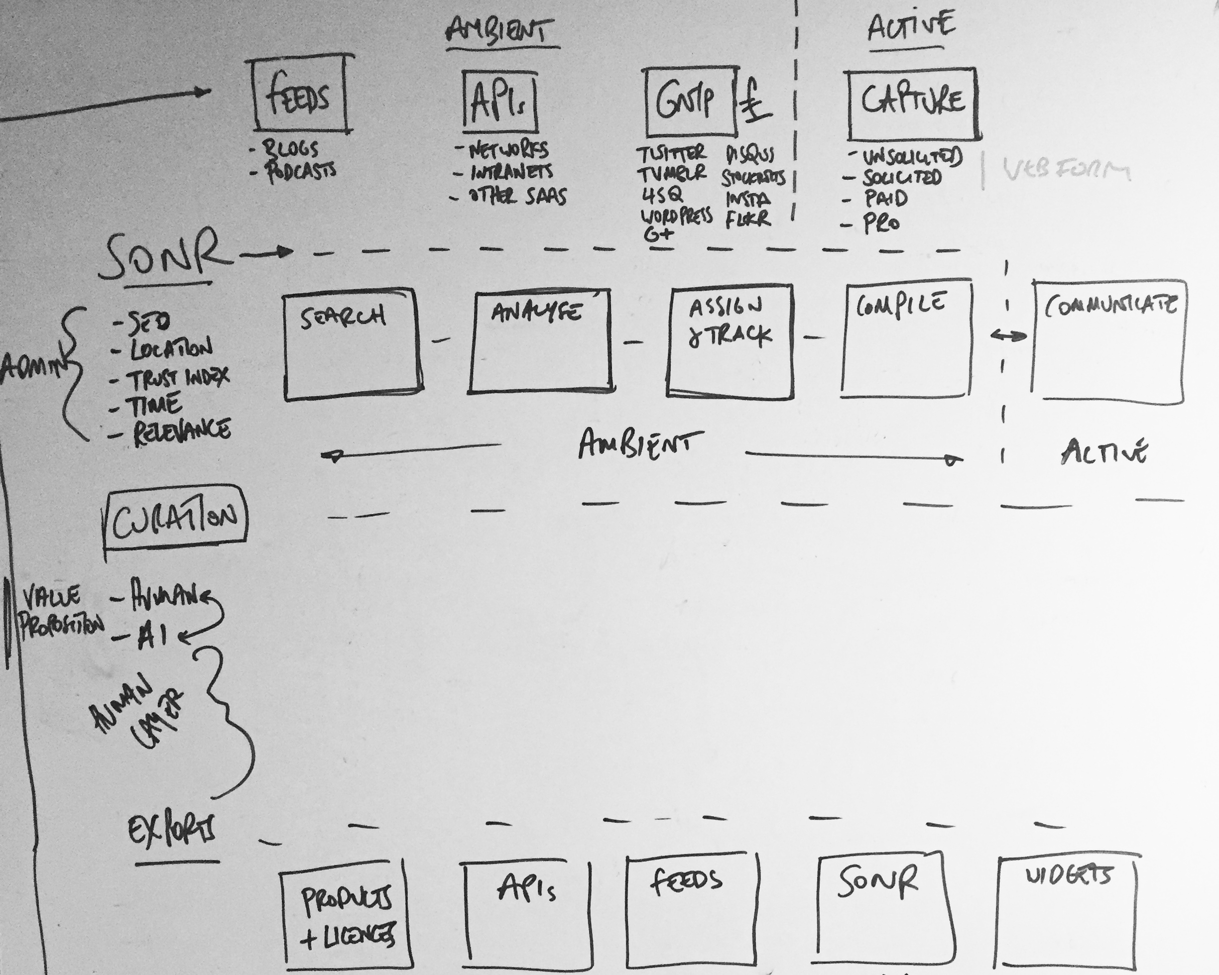
Active and Ambient states mapped out
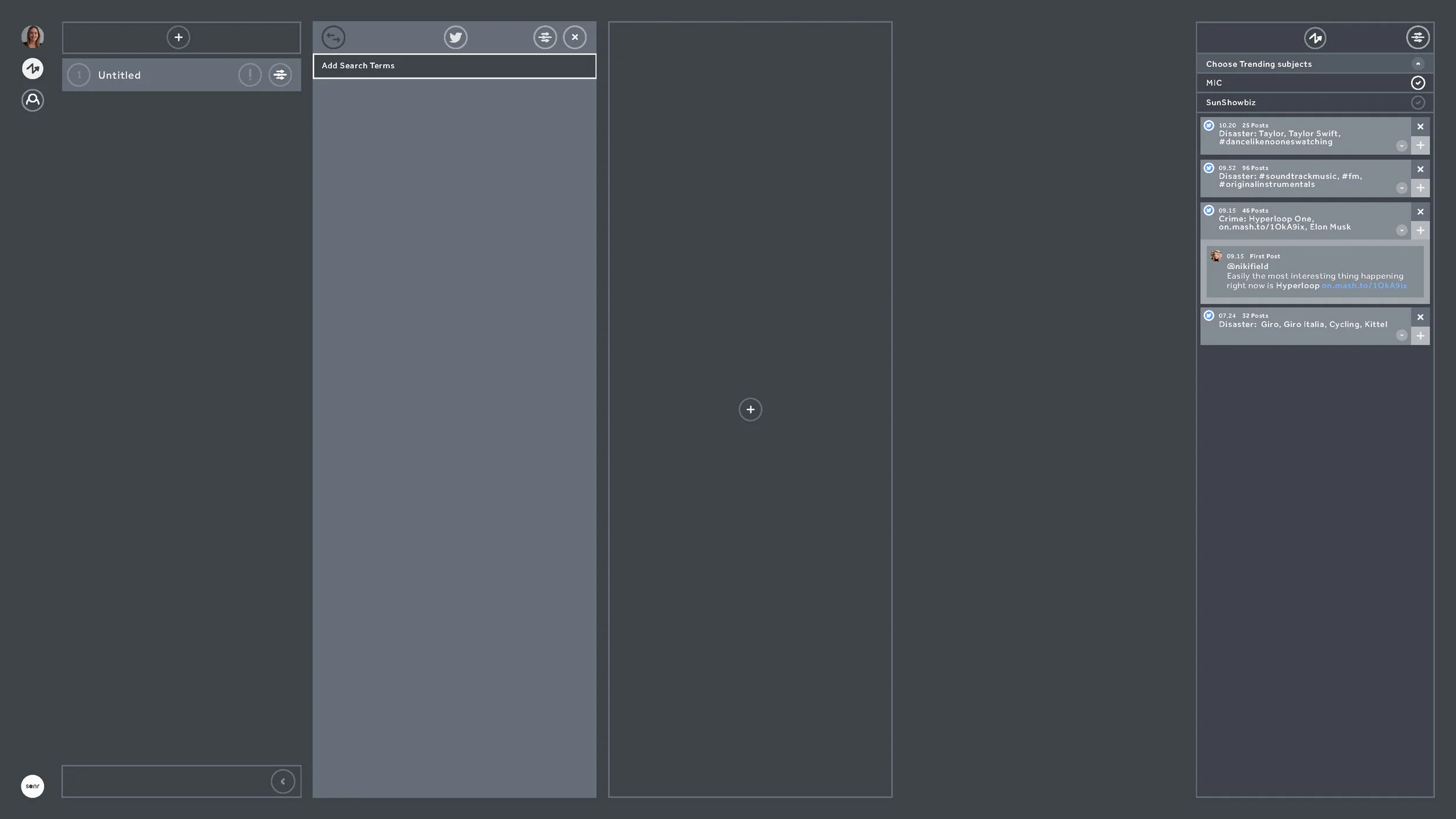
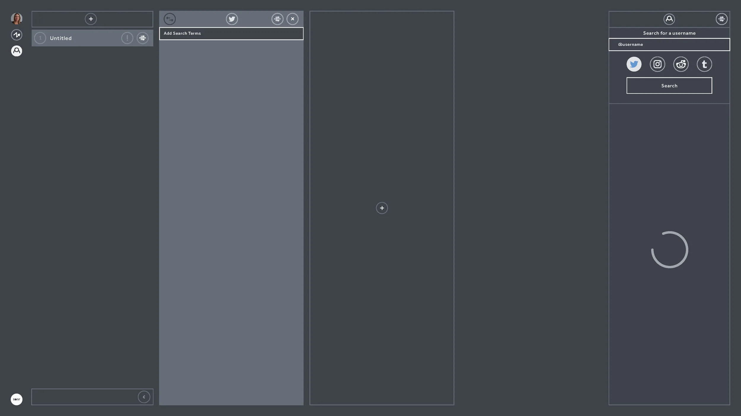
From here we moved as fast as we could to prove hypothesis - I placed these early versions in front of as many possible end users as possible. This was quick and dirty guerrilla-style user testing, the type straight out of the IDEO playbook. We changed some things off the back of that. We - of course - also trashed our user personas and wrote new ones, and began to really figure out the structure of the data behind what we were now building. We deep-dived into API documentation, we attended conferences (see below) and spoke with possible partners, we scouted competitors, we tried to work out better user flows, oh, and we had to raise some significant money (which we did). I created user flows, overlaid with data architecture to try to break down and visualise the actions of the user and the impact on the product. This broke down the product into 'user intentions' (which were effectively collections of related user flows) and 'product reactions' (which were how the product would react to a 'user intention'). This gave us a high level overview of user and product intended behaviour, with both influencing each other. A user could be administrating, searching, curating or exporting - meanwhile the product could be active or ambient at any given time.
Visting Twitter Flock 2015 NYC
Visting SXSW 2015 Austin TX
Iterating to v2 with our awesome new product team in Midtown, NYC
Around this time we'd begun to crystallise a product team in New York who were beginning to build out processes, set up Jira workflows and form QA schedules. We began to form more stringent user testing systems, and began to do one-on-one Google Hangout interviews. The distributed nature of these teams, between New York, London and San Francisco at this point began to place strain on product development, and marshalling it became a full time balancing act of clear documentation, scheduled Hangouts and constant Slack use. With this in mind we spent time in New York training the team there to become product design focused, allowing them more time autonomously working with the west coast team on product features. We also began to iterate the designs to fully incorporate our user feedback from testing. With new front end developers being hired we were now able to break away from our Bootstrap framework, and move to something more advanced and scaleable in ReactJS. Initially we kept the Bootstrap aesthetic (there was no rush for design beyond UX elements at this phase of the build) - icons, drop-downs, transitions - they were all defaults and generics. We were ignoring the details until we solved the bigger UX picture.
Distributed teams are *really* hard work and can 'jetlag' a product
There were also organisational problems to solve - distribution meant we had the problems that all distributed teams have - things fall through the gaps, and communication is hard. Being on hangouts across multiple timezones led to long days for those on GMT and deep investigations into the best conference calling and video calling tech (bottom line: there are no 'amazing' conference call headphones - but it's all about the microphone. We ended up with Sennheiser PC36's for group chat and the Jabra SPEAK 510 for portable conference calling - and always using Google Hangouts. Slack may change this space, but for now Google is the best).
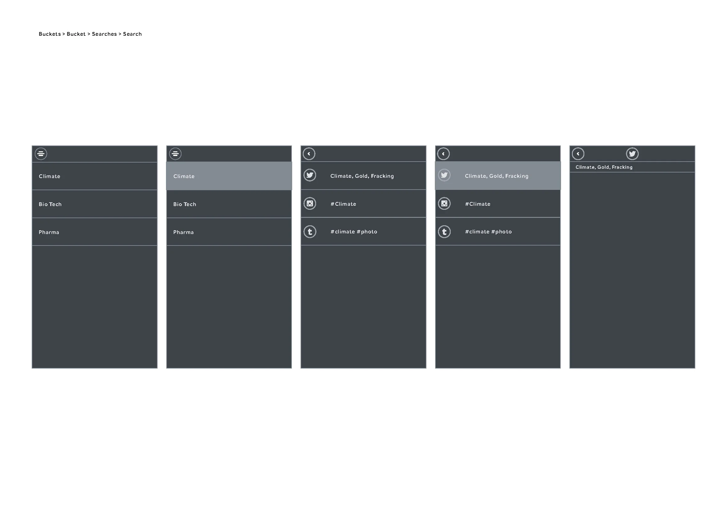
I began work on two things at this point - mobile (which was based in London) and documentation upgrades for those on the west coast. Documentation is often seen as a failure to pair-code, but while pair-coding is indeed best practise, it becomes near impossible with a 6-8 hour time difference. Here is the 'Manual' that was produced (below). The 'Manual' is written with a group definition (say 'Search' ) which is defined by the user Action, Behaviour and the related user stories that created the Action and Behaviour to be defined. Within each group there a section of each element that combines to group, each element having precise schematics defining it's default state, basic behaviour and basic action. This level of precise documentation prevents any grey areas forming, but also focuses the UX and product into defining every inch of the product and it's intended action - and making sure that this action is being supported by at least one user story (here's an excerpt from the 100 pages it eventually ran to).
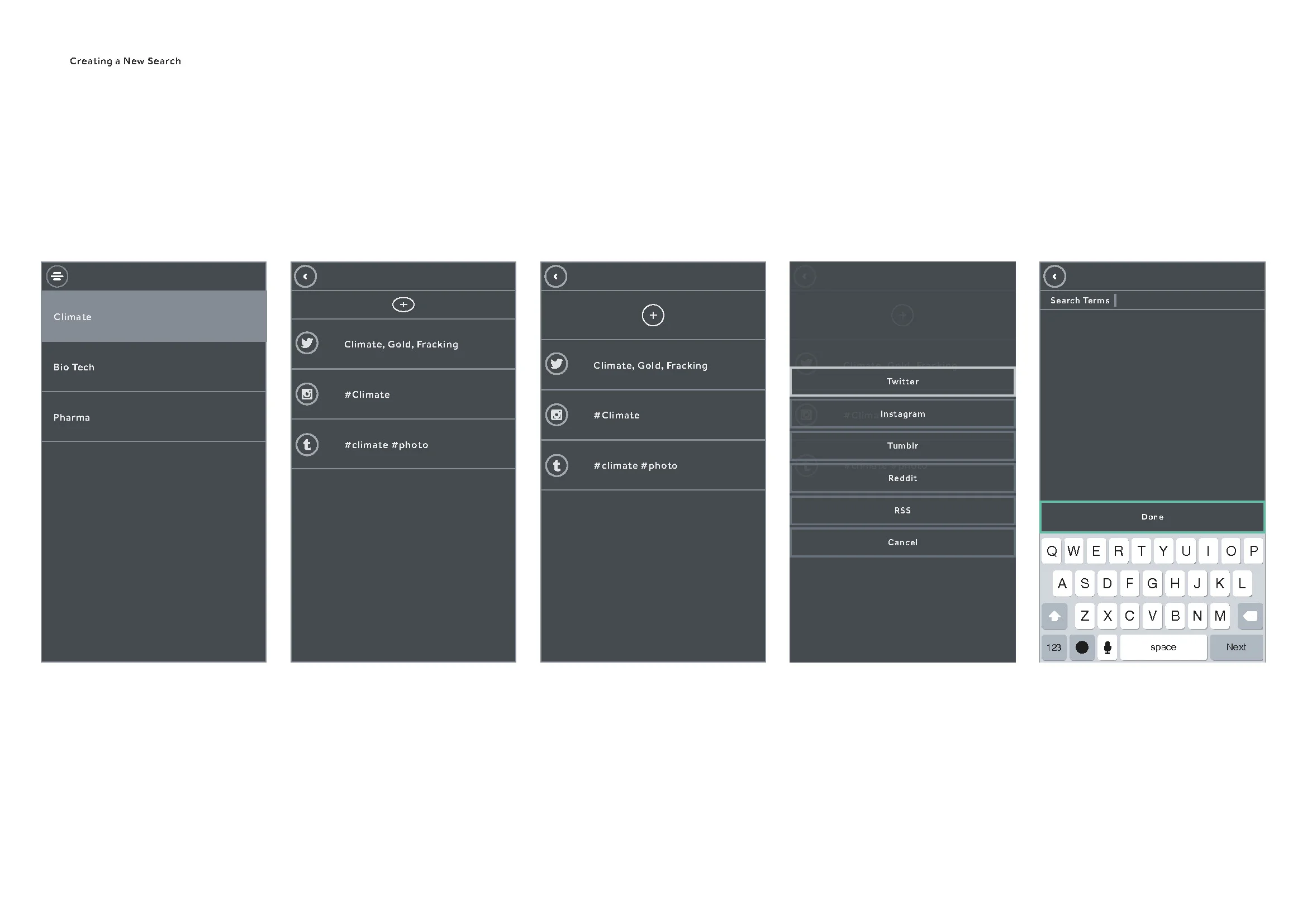
With mobile being in London, the need for such precise documentation wasn't so great. We could pair-code and whiteboard solutions. We still needed to define the actions though, and we used Flinto for the bulk of our prototyping. These prototypes were then user tested by the product team and with our user groups for feedback. The feedback was then incorporated into the wireframes (see below).
At this time we were getting significant feedback on the web side of the product, mainly about it's complexity. Now was the time to begin stripping away elements and beginning a process of reduction. Feature creep is inevitable, especially with diverse user testing groups, stakeholders and partnerships. The technology had also changed - our stack was nearing full development, but the partner APIs we accessed were developing at their own pace and changing. We also had ReactJS to consider as a framework - React works better in certain load scenarios than in others, and we were noticing lag in the front end performance. We began to simplify the design, but as we had defined and tested user stories we could focus more on the technological execution and making things more reliable, faster and economical.
Partner APIs are tricky beasts and by now, with large changes across most of the major social networks underway, some of our features - specifically the ones that attempted to unify some of the social network content - were becoming swiftly outdated (or worse - redundant). We were facing capping, call limits, sandboxing - the APIs were fluid and at the whim of their development teams. We soon realised we needed to simplify further. Like - waaaay further - and get to the core of the user stories that mattered and reduce the strain on the APIs. Some of the features were cool - some were 'wow' - but with the APIs in drift they would more often than not throw up an error or a time out. Effectively the experience we'd built was great when it worked, but was so prone to third party error we'd inadvertently built a frustrating experience that seemed buggy, but was in fact just feeding errors from APIs that we had no control over. This was a serious UX issue that needed resolving. We went back to the core ideas of the product and the subsequent research we'd done - along with all we knew about the APIs we'd been using. We chose to treat the APIs as individual elements which allowed for outages that wouldn't affect the UX as a whole. This also allowed us to prioritise individual network onboarding, sign-in, OAuth and sign-out.
Onboarding became a big focus at this stage. We'd done enough user testing and design reduction to know the sticking points of the product. We were focused on simple, clear and progressive steps to getting the user to make their first actions within seconds of sign-in.
Focusing on making the APIs individual not only meant we didn't have to worry too much about outages, but it also meant we could develop API specific features which could be seen only when that API was being used. This allowed users to search certain networks for people, but for us to allow background actions within certain rate limits. Returning back to the days of us whiteboarding it all in San Francisco - we could allow action and ambient processes. And now the action and ambient processes were decoupled from the various APIs, we could now focus on making them stronger features in their own right.
And with that - we shipped to public beta. We began some low level growth marketing around Medium (see here) and after getting some publication acceptance we quite quickly gained a lengthy beta waitlist.
